ButtonStyle
Allows controlling all visual aspects of a button, such as shape, foreground, background and shadow colors, content padding, border width and radius.
Most of these style attributes could be configured for all or particular
ControlState of a button,
such as HOVERED, FOCUSED, DISABLED and others.
Properties
alignment- The alignment of the button's content.animation_duration- Defines the duration in milliseconds of animated changes for shape and elevation.bgcolor- The button's background fill color.color- The color for the button's Text and Icon control descendants.elevation- The elevation of the button's Material.enable_feedback- Whether detected gestures should provide acoustic and/or haptic feedback.icon_color- The icon's color inside the button.icon_size- The icon's size inside of the button.mouse_cursor- The cursor to be displayed when the mouse pointer enters or is hovering over the button.overlay_color- The highlight color that's typically used to indicate that the button is focused, hovered, or pressed.padding- The padding between the button's boundary and its content.shadow_color- The shadow color of the button's Material.shape- The shape of the button's underlying Material.side- Defines the button's border outline.text_style- The text style of the button'sTextcontrol descendants.visual_density- Defines how compact the button's layout will be.
Methods
copy- Returns a copy of this object with the specified properties overridden.
Properties
alignmentclass-attributeinstance-attribute
alignment: Alignment | None = NoneThe alignment of the button's content.
animation_durationclass-attributeinstance-attribute
animation_duration: DurationValue | None = NoneDefines the duration in milliseconds of animated changes for shape and elevation.
bgcolorclass-attributeinstance-attribute
bgcolor: ControlStateValue[ColorValue] | None = NoneThe button's background fill color.
colorclass-attributeinstance-attribute
color: ControlStateValue[ColorValue] | None = NoneThe color for the button's Text and Icon control descendants.
elevationclass-attributeinstance-attribute
elevation: ControlStateValue[Number | None] | None = NoneThe elevation of the button's Material.
enable_feedbackclass-attributeinstance-attribute
enable_feedback: bool | None = NoneWhether detected gestures should provide acoustic and/or haptic feedback.
icon_colorclass-attributeinstance-attribute
icon_color: ControlStateValue[ColorValue] | None = NoneThe icon's color inside the button.
If not set or None, then the color will be used.
icon_sizeclass-attributeinstance-attribute
icon_size: ControlStateValue[Number | None] | None = NoneThe icon's size inside of the button.
mouse_cursorclass-attributeinstance-attribute
mouse_cursor: ControlStateValue[MouseCursor] | None = NoneThe cursor to be displayed when the mouse pointer enters or is hovering over the button.
overlay_colorclass-attributeinstance-attribute
overlay_color: ControlStateValue[ColorValue] | None = NoneThe highlight color that's typically used to indicate that the button is focused, hovered, or pressed.
paddingclass-attributeinstance-attribute
padding: ControlStateValue[PaddingValue] | None = NoneThe padding between the button's boundary and its content.
shadow_colorclass-attributeinstance-attribute
shadow_color: ControlStateValue[ColorValue] | None = NoneThe shadow color of the button's Material.
shapeclass-attributeinstance-attribute
shape: ControlStateValue[OutlinedBorder] | None = NoneThe shape of the button's underlying Material.
sideclass-attributeinstance-attribute
side: ControlStateValue[BorderSide] | None = NoneDefines the button's border outline.
text_styleclass-attributeinstance-attribute
text_style: ControlStateValue[TextStyle] | None = NoneThe text style of the button's Text control descendants.
visual_densityclass-attributeinstance-attribute
visual_density: VisualDensity | None = NoneDefines how compact the button's layout will be.
Methods
copy
copy(
    color: ControlStateValue[ColorValue] | None = None,
    bgcolor: ControlStateValue[ColorValue] | None = None,
    overlay_color: ControlStateValue[ColorValue]
    | None = None,
    shadow_color: ControlStateValue[ColorValue]
    | None = None,
    elevation: ControlStateValue[Number | None]
    | None = None,
    animation_duration: DurationValue | None = None,
    padding: ControlStateValue[PaddingValue] | None = None,
    side: ControlStateValue[BorderSide] | None = None,
    shape: ControlStateValue[OutlinedBorder] | None = None,
    alignment: Alignment | None = None,
    enable_feedback: bool | None = None,
    text_style: ControlStateValue[TextStyle] | None = None,
    icon_size: ControlStateValue[Number | None]
    | None = None,
    icon_color: ControlStateValue[ColorValue] | None = None,
    visual_density: VisualDensity | None = None,
    mouse_cursor: ControlStateValue[MouseCursor]
    | None = None,
) -> ButtonStyle
Returns a copy of this object with the specified properties overridden.
Usage example
You can configure a different shape, background color for a hovered state and configure fallback values for all other states.
To configure style attribute for all Material states set its value to a literal (or class instance). For example, if you set color property to a literal the value will be applied to all button states:
ButtonStyle(
    color=ft.Colors.WHITE
)
To configure style attribute for specific Material states set its value to a dictionary where the key is state name. For example, to configure different background colors for HOVERED and FOCUSED states and another colors for all other states:
ButtonStyle(
    color={
        ft.ControlState.HOVERED: ft.Colors.WHITE,
        ft.ControlState.FOCUSED: ft.Colors.BLUE,
        ft.ControlState.DEFAULT: ft.Colors.BLACK,
    }
)
Various button shapes example
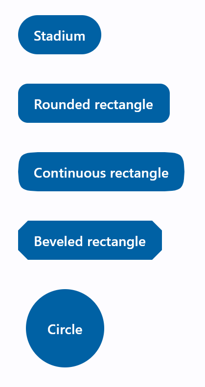
import flet as ft

def main(page: ft.Page):
    page.padding = 30
    page.spacing = 30
    page.add(
        ft.FilledButton(
            "Stadium",
            style=ft.ButtonStyle(
                shape=ft.StadiumBorder(),
            ),
        ),
        ft.FilledButton(
            "Rounded rectangle",
            style=ft.ButtonStyle(
                shape=ft.RoundedRectangleBorder(radius=10),
            ),
        ),
        ft.FilledButton(
            "Continuous rectangle",
            style=ft.ButtonStyle(
                shape=ft.ContinuousRectangleBorder(radius=30),
            ),
        ),
        ft.FilledButton(
            "Beveled rectangle",
            style=ft.ButtonStyle(
                shape=ft.BeveledRectangleBorder(radius=10),
            ),
        ),
        ft.FilledButton(
            "Circle",
            style=ft.ButtonStyle(shape=ft.CircleBorder(), padding=30),
        ),
    )

ft.run(main)
Styled button example
Check the following example:
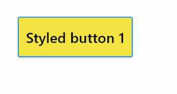
import flet as ft

def main(page: ft.Page):

    page.add(
        ft.Button(
            "Styled button 1",
            style=ft.ButtonStyle(
                color={
                    ft.ControlState.HOVERED: ft.Colors.WHITE,
                    ft.ControlState.FOCUSED: ft.Colors.BLUE,
                    ft.ControlState.DEFAULT: ft.Colors.BLACK,
                },
                bgcolor={ft.ControlState.FOCUSED: ft.Colors.PINK_200, "": ft.Colors.YELLOW},
                padding={ft.ControlState.HOVERED: 20},
                overlay_color=ft.Colors.TRANSPARENT,
                elevation={"pressed": 0, "": 1},
                animation_duration=500,
                side={
                    ft.ControlState.DEFAULT: ft.BorderSide(1, ft.Colors.BLUE),
                    ft.ControlState.HOVERED: ft.BorderSide(2, ft.Colors.BLUE),
                },
                shape={
                    ft.ControlState.HOVERED: ft.RoundedRectangleBorder(radius=20),
                    ft.ControlState.DEFAULT: ft.RoundedRectangleBorder(radius=2),
                },
            ),
        )
    )

ft.run(main)